
Brand Portal · Release C.2 · As of 23 October 2026
Geometry becomes
recognition.
Every binding rule for the nuARC brand in one place: logo, color, typography, layout, language and application, together with the original files to download. Anyone designing for nuARC, in house or as an agency, exhibition builder or print shop, works from this document.
00 · Overview
The essentials on one screen
If you only have a minute, these six values are enough. Everything else on this page explains, justifies and extends them.
The governing principle. Consistency before decoration. The wordmark is not reinterpreted. Applications defer to its geometry, its color and its calm. Where this page states a rule, the rule applies. Where it states none, the attitude applies: technical, precise, restrained.
How to read this document
Rules are either approved or draft. Both are marked, so nobody has to guess what is already binding.
- Approved Release C.2 Verified and binding. Any deviation requires sign-off from Creative Direction.
- Draft approval pending Proposed by Creative Direction, usable in practice, but not yet signed off. Subject to change. Check back before sending production data to print.
01 · The brand
What nuARC stands for
nuARC is the brand of A.R.C. Laser GmbH. It appears wherever devices, applications and clinical communication become visible to physicians. The brand does not promise a future, it demonstrates precision.
Name and spelling
The name is always written nuARC: lowercase n, lowercase u, then ARC in capitals. This spelling applies in body copy, forms, file names, metadata and subtitles, including everywhere the wordmark cannot be used as an image.
| Correct | Wrong | Why |
|---|---|---|
| nuARC | NuArc, NUARC, nuArc, Nu-ARC | The jump in height between lowercase and capitals is part of the brand, not a typo for autocorrect to smooth out. |
| nuARC | nuARC®, nuARC™ | Add trademark symbols only where legal explicitly requires them for the market in question, never as decoration. |
| A.R.C. Laser GmbH | ARC Laser GmbH | The legal entity keeps its periods. Only the brand is called nuARC. |
Start of a sentence. When nuARC opens a sentence, the n stays lowercase. Where that reads badly, rewrite the sentence rather than change the brand.
Claim
The claim is Precision in Every Pulse. It stays in English in every language, including German, and is never translated. It is an independent text element and not part of the wordmark: it is never set inside the logo, never merged with it into a single file, and never scaled along with it.

Precision in Every Pulse
Like this. Claim below the wordmark, its own spacing, Geist Mono, capitals, 0.2 em letter spacing.
Rules for the claim
- At least 1 × m away from the wordmark, left aligned to it.
- Set in Geist Mono, capitals, 0.2 em letter spacing.
- Color: Active Green on Navy, Navy on a light background.
- The claim is optional. It is dropped on devices, signage and in small sizes.
- Never repeat it in the same sentence as the brand name.
Design attitude approval pending
Three qualities decide whether a design looks like nuARC. They help wherever no rule applies.
Calm
Generous white space, few elements, no decorative card landscapes. Tinted areas are functional, not ornamental.
Measurable
Where a number exists, the number is shown. Dimensions, axes and values are set in Geist Mono rather than described in words.
One accent
Exactly one point per surface lights up. If everything glows, nothing does. The A in the logo takes precedence.
Legal entity and sender
Brand and legal entity are two different things and are not mixed.
- The brand in the public face The nuARC wordmark on covers, title pages, trade show stands, devices, the website and in communication.
- The legal entity in the fine print A.R.C. Laser GmbH with its full address in the imprint, footers, quotations, invoices, contracts and on every document with regulatory relevance.
- Medical device labeling takes precedence Where standards prescribe the marking of a device, packaging or instructions for use, the standard wins. This guideline governs design, it does not override a regulatory obligation.
02 · Logo
One wordmark. One distinct center.
The A carries color, height and meaning. n, u, R and C form the technical frame. The mark is always judged as the interplay of all five characters.
Master wordmark
Primary version. Full color wordmark on a light, calm background.
File nuarc-wortmarke-farbig.svg, viewBox 529.3 × 116.39.
This one file is the master. Older exports with a width of 526.5 predate the correction of the R-C gap and are invalid. If you find a file with 526.5 in its viewBox, replace it with the master from the download section.
Approved variants
Whenever medium and background allow it, the full color primary version is used. Every other variant solves a technical reproduction problem; none of them is a matter of taste.
01 · Full color, primary. Light, neutral background. First choice.
02 · Dark background. White lettering, the A keeps the color axis. approval pending

03 · Reversed, single color. All white. For engraving, vinyl cutting and single color print.

04 · Monochrome. All Navy, black as a fallback. For stamps, fax and single color production.
On variant 02. Logo Guideline C.2 so far knows only "reversed, single color". In practice, dark title areas, trade show walls and displays need a version that keeps the color axis, otherwise the brand loses its center exactly where it appears largest. The version is built and included in the download package; formal sign-off by Creative Direction is pending.
The A signet
The isolated A is not a second logo. It appears only where the viewer already knows the brand and there is no room for the wordmark.

Full color

Navy

White

App icon
- Permitted Favicon, app icon, profile picture on social networks, marking on small parts, and as a repeating element inside a layout that already carries the wordmark.
- Not permitted As the sender on first contact, on a title page, on a trade show stand, on a device front, or anywhere the brand is shown for the first time. The signet does not replace the wordmark.
Construction
The drawing below is a formal reconstruction. It explains the design logic of the wordmark coherently, but does not claim that the historical original was produced exactly this way.
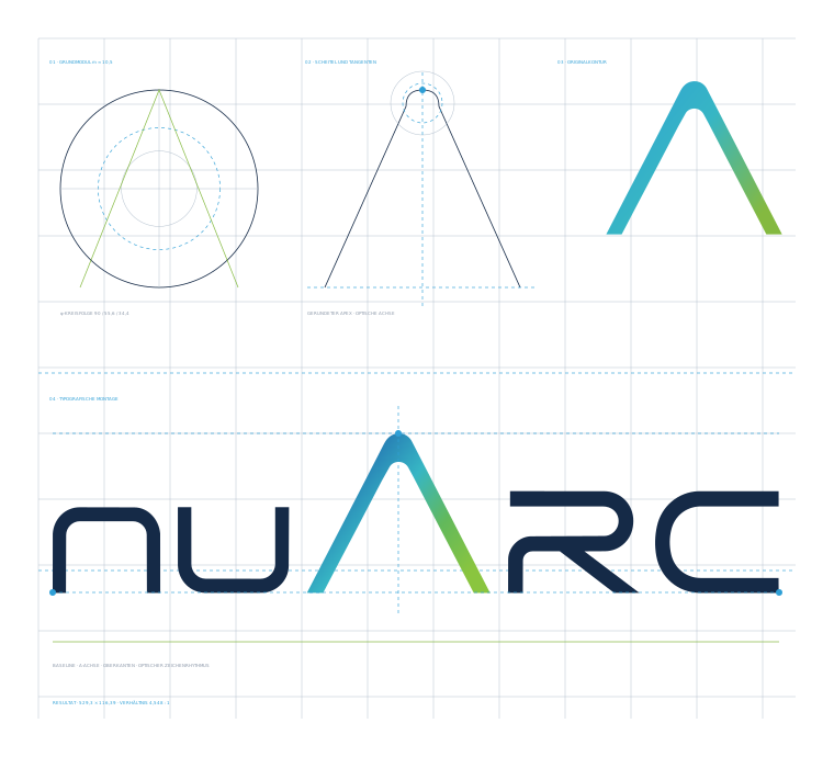
The base module m
The wordmark shows a robust base module of roughly 10.5 master units. It sits close to the central stroke widths and base radii and is the reference for clear space and spacing.
φ is a check, not an origin
Neither the overall width (4.548) nor A base to A height (1.148) follows the golden ratio. The quality comes from module, axis, rounding and optical correction. φ remains a testing instrument and must not be presented as an origin story.
Measured character rhythm
| Gap | Value | Assessment |
|---|---|---|
| n-u | 12.8 | Stable triad together with u-A and A-R. |
| u-A | 13.1 | Reference value of the rhythm. |
| A-R | 13.1 | Reference value of the rhythm. |
| R-C | 11.5 | Approved correction, previously 8.7. It now follows the rest of the rhythm without looking mathematically rigid. |
The shape of the A
The identity of the A does not come from two diagonals. What matters is the softly modeled apex, the rounded inner contour and the optical rather than purely mathematical centering. The deviation of the overall base from perfect axial symmetry is about 0.1 units and is intentional.
Clear space
Open space preserves the tension between the tall A and the flat typographic line. The base module m is the starting value. Nothing sits inside the clear space: no text, no rule, no image edge, no second logo.
At least 1 × m on all sides, 2 × m preferred for title pages, trade show applications and anything with a representative role.
Conversion for everyday use. m is roughly 9 percent of the wordmark height, that is about 2 percent of its width. A wordmark 100 mm wide therefore needs about 2 mm of clear space, 4 mm preferred.
Minimum sizes
| Application | Minimum width | Note |
|---|---|---|
| Print, standard | 32 mm | Full color primary version. Applies to paper, packaging and signage. |
| Screen, standard | 120 px | Below this, check the rounding and color gradient of the A on real devices, not only in the layout application. |
| Small format | below 24 mm | Use the monochrome version. At these sizes the gradient is no longer read anyway and only makes printing more fragile. |
| Signet | 16 px | Tested as a favicon. Below this the inner rounding closes up and the mark becomes illegible. |
What is not permitted
- Replacing the A No hard triangle, no two straight bars, no generic outline icon. The rounded contour is the brand.
- Touching the geometry Changing the R-C gap again, scaling individual characters, squashing the A down to the shared cap height, or distorting the wordmark.
- Introducing foreign colors Violet, orange or further domain colors in the A gradient. The axis stays blue, cyan, green.
- Adding effects Drop shadows, glows, outlines, embossing, reflections or custom gradients.
- Placing it on a restless background Photographs, patterns or color fields that disturb the gradient of the A. If no calm background is possible, use the monochrome version.
- Presenting the construction drawing as history It is a reconstruction and is labeled as one.
03 · Color
Blue leads. Green activates.
The A glows more strongly than the typography, yet stays on a single chromatic axis. Blue dominates, cyan connects, green closes.
The blue-green axis
Brand element gradient rule.
linear-gradient(90deg, #2E9FD6, #152A47 43%, #37B6C4 68%, #84B940)
#2E9FD6 · rgb(46, 159, 214)
Leads the axis. System rules, measurement points, active states.
#37B6C4 · rgb(55, 182, 196)
Connects blue and green. Only inside the gradient, never as its own fill.
#84B940 · rgb(132, 185, 64)
Closes the axis. Exactly one accent per surface.
Why there is no violet in the logo. The logo axis has to work as an independent nuARC signature, not as a complete legend of every clinical domain. Violet weakened the optical continuity and the proximity to the existing regulatory system. The domain colors below are unaffected: they belong in charts and clinical communication, not in the A.
Color roles
Each color has exactly one job. Using a color for something else makes the system unreadable, even when the individual result looks good.
#152A47
Typography, wordmark, primary technical rules, dark surfaces.
#1D3A5F
Second level inside dark surfaces, links, hover.
#1B2637
Body copy on a light background.
#55637A
Second text level, introductions, captions.
#8B97A8
Metadata, dimensions, axis labels, footers. Never body copy.
#DDE3EA
Dividers, frames, table rules.
#F4F7FA
Functional tint. No decorative card landscapes.
#EAF1F6
Emphasis inside a panel, code, highlighting.
Red is not a design color. Rules, underlines, edges, arrows and highlights are blue. Red appears only where an actual error or warning is being reported, for example a failed operation in a log. Never as an accent, never as decoration.
Domain colors
Charts, product overviews and clinical communication that distinguish between medical specialties use a separate color set. It sits alongside the brand system and does not replace it.
#1E6FB8Ear, nose and throat.
#77B227Eye care.
#C76A1FProctology.
#7B4BBEEndovenous laser ablation.
Trap. The ophthalmology green #77B227 is not the brand green
#84B940. When coloring by specialty, the domain color wins. Never swap the
two values, and never use them side by side in one chart as two different meanings.
Contrast and legibility
Measured contrast ratios according to WCAG 2.1. These values are calculated, not estimated. They decide which color may be text and which may only be a surface.
| Foreground | Background | Ratio | Use |
|---|---|---|---|
| Navy #152A47 | White | 14.44 : 1 | Body copy, headings, anything. |
| Ink #1B2637 | White | 15.23 : 1 | Body copy, anything. |
| Sub #55637A | White | 6.08 : 1 | Second text level, safe from 14 px up. |
| White | Navy #152A47 | 14.44 : 1 | Reversed text, anything. |
| Active Green #84B940 | Navy #152A47 | 6.19 : 1 | Accent text on a dark surface, permitted. |
| Bridge Cyan #37B6C4 | Navy #152A47 | 5.95 : 1 | Permitted on a dark surface. |
| Signal Blue #2E9FD6 | Navy #152A47 | 4.85 : 1 | Permitted on a dark surface. |
| Signal Blue #2E9FD6 | White | 2.98 : 1 | Not as text. Surface, rule or icon from 24 px only. |
| Bridge Cyan #37B6C4 | White | 2.43 : 1 | Not as text. Gradient only. |
| Active Green #84B940 | White | 2.33 : 1 | Not as text. Surface and accent rule only. |
| Faint #8B97A8 | White | 2.96 : 1 | Not as body copy. Metadata in capitals from 11 px, and sparingly even there. |
Rule of thumb. The three axis colors are not text colors on white. Setting blue, cyan or green as type on a light background falls below the minimum contrast. On Navy all three work.
04 · Typography
Two families, three roles
Headings are set in Manrope, text in the house typeface Geist, with Geist Mono as its technical companion. All three are published under the SIL Open Font License, can be self hosted and may be passed on to agencies, exhibition builders and print shops at no license cost.
Manrope, Geist and Geist Mono
Manrope
nuARC 0123456789
Headings and subheadings, always in SemiBold 600. Full Cyrillic and Greek, so all six website languages share the same display typeface.
Geist
nuARC 0123456789
Body copy, emphasis, interface elements. Nine genuine weights from 100 to 900, all verified in rendering.
Geist Mono
nuARC 0123456789
Metadata, dimensions, axis labels, footers, codes, part numbers. It replaces any system monospace, which looks different on every machine.
Why not Acumin Pro. Acumin depends on an active Adobe subscription, cannot be self hosted, and on the web is only reachable through a kit tied to one personal account. For a brand that runs on the web and is handed to external partners, that is unworkable. Geist is the replacement and has been in force since July 2026.
Why Manrope for headings. The earlier display typeface Rajdhani looked too playful for medical technology. Manrope is calm and geometric, matches the curves of the wordmark and stands apart from Geist without competing with it. It is the only one of the eight candidates tested with full Cyrillic and Greek. Every weight was measured in rendering rather than taken on trust from the font API. In force since 23 October 2026.
Sizes and weights
Hierarchy is built from weight and color, not from size alone. The values apply to screen; convert to points for print.
Setting rules and traps
- Geist has no arrow glyph The right arrow character is missing from the font. Setting it silently falls back to a system typeface and looks wrong in the PDF. Avoid arrows in running text and use words instead. Where a direction has to be shown, set an icon as a vector.
- Verify weight 300 before you rely on it Not every typeface has a genuine light weight. Some web font interfaces accept the value 300 without complaint and serve regular anyway. It only shows up in the printed PDF, because the whole page then runs one step too heavy. Geist has real light, but the check stays mandatory as soon as another typeface enters the system.
- Line length Body copy runs to a maximum of 66 characters. Beyond that the eye loses the line.
- No em or en dashes as punctuation Use a comma, a colon, parentheses, a semicolon or two sentences. Hyphens in compound words are unaffected.
- Real characters in every language German text keeps ä ö ü Ä Ö Ü ß, never ae, oe, ue or ss as substitutes. The same applies to accents in French, Spanish and Nordic text. Substitute spellings belong only in file names, paths, code identifiers and URLs. Anything a person reads gets the real characters, including table values and axis labels.
- No emoji Including emoji-like Unicode symbols such as check marks, crosses or filled circles. Depending on the system they render as a colored blob. Use vector icons or plain words instead.
05 · Layout
Space carries information
Principle
A nuARC layout consists of a few clearly separated zones. White space is not what is left over, it is the means by which important things become important. Areas are tinted because they have a function, not because the page would otherwise look empty.
- Header with the wordmark on the left and technical metadata on the right, in Geist Mono.
- Below it the gradient rule as a brand element, 1.1 mm in print, 4 px on screen.
- Headline and introduction, then the content in no more than three levels.
- Footer with the topic on the left and page number or status on the right, separated by a hairline.
Recurring elements
Gradient rule
Quotes the underline of the logo. It sits below the header, never in the middle of text, never twice on a page.
Section label
05 · Layout
Capitals, Geist Mono, 0.16 em letter spacing, Faint. In print it additionally carries a 1.2 mm edge on the left, alternating green and blue.
Key figure tiles
Large number in Geist Bold, short description below. In print with a colored top edge, rotating navy, blue, green.
Callout
One core statement, one thought, three lines at most.
Panel surface with a 3 px edge on the left. Blue for notes, green for decisions, navy for governing principles.
Anatomy of a page
Confidential · As of 18 Sept 2026
01 · Section
Title of the page
An introduction in one sentence that says what this is about and does not repeat what the headline already said.
nuARC Brand Portal · Page 1
PDF rule. Every generated PDF is reviewed page by page before it is
shared. No truncated tables, no heading stranded at the foot of a page, no half boxes, no
empty final page. Set it up in advance: break-inside: avoid on cards, boxes
and table rows, break-after: avoid on headings, table heads as
table-header-group, orphans: 3 and widows: 3.
06 · Imagery
Devices, not stock symbolism approval pending
Imagery is the last open part of this guideline. The direction below is the proposal of Creative Direction and is not yet binding. It is enough to brief a commission, but not enough to sign off a campaign.
Attitude
- Real devices before rendering aesthetics High quality product visualization with real materials: paint, screen print, vinyl, display, backlit lettering. No generic tech or software mockups.
- White, navy, axis Imagery uses the same palette as the layout. Color comes from the subject and from the axis, not from filters.
- European industrial aesthetics Medical and technical precision, calm light, clean edges. No warm advertising light, no staged emotion.
- Overall scene and detail Every application needs both: the overview that explains the situation, and the close-up that shows the quality of the finish.
- Not permitted Stock photography of physicians in backlight, blue data grids, floating holograms, lens flares, artificial bokeh over the logo.
Technical specifications
| Use | Format | Resolution | Note |
|---|---|---|---|
| TIFF, PDF/X | 300 dpi at final size | CMYK, profile agreed with the print shop. The logo stays vector and is never embedded as an image. | |
| Large format | PDF, TIFF | 100 dpi at final size minimum | At a viewing distance beyond three meters, 72 dpi is sufficient. Agree this with the exhibition builder first. |
| Web | WebP, JPEG as fallback | 2× the display width | Always declare width and height on images in the page, otherwise the layout jumps while loading. |
| Video | H.264, MP4 | 1080p or 4K | Two pass encoding, audio normalized. Raw trade show footage is always re-encoded. |
Open items. Sign-off still needs images for six situations: a laser device carrying the wordmark, a housing detail with the A signet, an operating panel or start screen, a trade show stand in large format, a trade show detail with counter and signage, and optionally a transport case or packaging. Only then does this chapter become binding.
07 · Language
Write plainly, be specific approval pending
Tone
nuARC speaks to a professional audience. The tone is factual, concise and evidenced. If you have a number, give the number. If you do not, promise nothing.
Like this
- "The procedure takes 14 minutes on average."
- "The device weighs 8.2 kg and can be carried by one person."
- "Approved under MDR, class IIb."
Not like this
- "Revolutionary technology that changes everything."
- "Seamless, robust and powerful."
- "It is not just a laser, it is a promise."
Banned phrases. "It is not just X, it is Y", "Let's dive in", "In today's fast-paced world", "unleash", "seamless" and "powerful" as filler, forced lists of three, and summaries that only repeat what was just said. Sentences like these read as machine written and undermine the credibility of a medical device manufacturer.
Spelling and conventions
English texts use American spelling, consistent with the existing nuARC applications and product documentation. Choose once and stay with it; mixed spelling within one document is the visible mistake, not the variant itself.
| Write | Not | Note |
|---|---|---|
| nuARC | NuArc, NUARC | See chapter 01. |
| A.R.C. Laser GmbH | ARC Laser | The legal entity only, not the brand. |
| Precision in Every Pulse | Präzision in jedem Impuls | The claim stays in English in every language. |
| color, center, analyze | colour, centre, analyse | American spelling throughout. |
| 8.2 kg · 14 mm · 30 % | 8,2kg, 14mm, 30% | Decimal point in English, non-breaking space before the unit. |
| 18 September 2026 | 09/18/26 | Spelled out in running text. In tables and metadata use ISO format, 2026-09-18, which is unambiguous in every market. |
| physicians, clinicians | doctors (informal), users | Name the professional group. Avoid gendered constructions rather than working around them with symbols. |
Translations. German and English are maintained in parallel, they are not machine translated from one another. Clinical, regulatory and safety-related wording is reviewed by the responsible department in each language before publication, not adapted by the designer.
08 · Applications
Where the brand appears
Web, favicon and app icon
-
Favicon Embed
nuarc-signet-farbig.svgas SVG, with a 512 px PNG as a fallback. The full color signet stays legible on dark browser interfaces, so no separate dark version is required. -
App icon
nuarc-appicon.svg, navy surface with a corner radius of 22 percent of the edge length, A in full color. Supplied as PNG at 180, 192, 512 and 1024 px in the download package. -
Serve the fonts yourself Load Geist via
@font-facefrom your own server, not from a third party CDN. That saves a third party in the privacy notice and keeps the site independent. -
Theme color
<meta name="theme-color" content="#152a47">for the browser bar on mobile devices.
Office and documents
Word, PowerPoint and Excel use the same palette and the same typeface. Geist is installed locally as OTF so that documents do not fall back to Calibri on the recipient's machine.
- Title page: wordmark top left, gradient rule below it, title in Geist Bold Navy.
- Body copy Geist Regular 11 pt, line spacing 1.3, color Ink.
- Table heads Navy with white type, row rules in Line, no full grid.
- Footer in Geist Mono 7 pt, capitals, Faint: topic on the left, page number on the right.
- No colored page background, no shadows beneath boxes.
Before sending. Documents that leave the building are exported as PDF, not sent as Office files. That preserves the typeface and prevents comments and tracked changes from traveling along.
Email signature
Maximilian A. Grimm
Creative DirectorA.R.C. Laser GmbH
Bessemerstraße 14, 90411 Nürnberg, Germany
Structure. Wordmark, gradient rule, name, role, legal entity, address.
Rules
- Embed the wordmark as a PNG 104 px wide, with double resolution behind it.
- Gradient rule as a 120 × 3 px PNG, not as CSS. Many mail clients do not render gradients.
- Set the mail client to a system typeface. Geist is not loaded in the recipient's mailbox, and a web font reference only produces a tracking request.
- No quotations, no environmental appeals, no social networks as an image strip.
- Mandatory disclosures under section 35a of the German Limited Liability Companies Act in full: company, registered office, register court, commercial register number, managing directors.
Device and signage
- Device front Wordmark, not signet. Full color on a light housing, the dark background version on a dark one.
- Engraving, embroidery, vinyl Always the monochrome version. A gradient cannot be engraved and turns into a solid area when cut.
- Rating plate and labeling Regulatory information, CE marking, UDI and warnings follow the applicable standard and are not adjusted for design reasons. The brand defers here.
- Test before the production run Every new material gets a sample: CMYK proof at 32 mm and below, an engraving sample, an embroidery sample, a vinyl sample. Only then does it go into production.
Trade show and large format
- The wordmark is the largest element on the back wall. No claim, no slogan above it.
- Clear space scales with it: at large format at least 2 × m, preferably more.
- Backlit lettering uses the dark background version. The gradient stays; light boxes are not produced in monochrome.
- Counters and signage carry the signet rather than the wordmark, once the back wall already shows the wordmark.
- Always supply production data with type converted to outlines. The outlined version of the guideline in the download section is the reference for this.
09 · Downloads
Original files
Everything here is the current version. If you find an older file on a drive, replace it with this one. For special applications, Creative Direction decides, not whatever file happens to be available.
Note on the PDFs. The three guideline PDFs currently exist in German only. Every rule they contain is reproduced in full on this page in English, so nothing is missing. An English edition of the PDFs can be produced on request.
Which file for which purpose
| Situation | File | Why |
|---|---|---|
| Website, app | nuarc-wortmarke-farbig.svg | Vector, scales without loss, a few kilobytes. |
| Office, PowerPoint | nuarc-wortmarke-farbig-2000.png | SVG renders unreliably in Office. |
| Print, advertisement | nuarc-wortmarke-farbig.svg | Place it in Illustrator or InDesign, not as a PNG. |
| Engraving, embroidery, vinyl | nuarc-wortmarke-monochrom-navy.svg | Single color, no gradient steps. |
| Dark surface, display | nuarc-wortmarke-dunkelgrund.svg | White lettering, color axis preserved. |
| Favicon | nuarc-signet-farbig.svg | Cropped to a square, no empty margin. |
10 · Approval and status
Who decides, and what currently applies
Creative Direction
Maximilian A. Grimm
Creative Director, A.R.C. Laser GmbH
Decides on deviations, special applications and every item marked as a draft on this
page.
Marketing
L. Zoe Geist
Marketing Manager, A.R.C. Laser GmbH
Responsible for applying and distributing the guideline in ongoing activities.
What is still open
- Imagery Six subjects are missing, see chapter 06. Until then the art direction there is a brief, not an approval.
- Dark background version Built and included in the package, formal sign-off pending.
- Production tests CMYK proof at 32 mm and below, favicon on real devices, engraving, embroidery, vinyl. Only then are the minimum sizes raised from starting rule to final approval.
Change history
- Display typeface Manrope introduced, Rajdhani dropped for good. Headings and subheadings in Manrope SemiBold 600, text stays in Geist. Font package extended with Manrope.
- Brand portal set up in German and English. Logo Guideline C.2 adopted in full and extended with brand, color roles, typography, layout, imagery, language and applications. Signet re-cropped to a square, app icon, dark background version and monochrome versions built, contrast ratios calculated.
- Release C.2. Color axis fixed to blue, cyan, green; violet and orange removed from the A. Guideline typeset in A3 landscape and A4, production data generated with type converted to outlines.
- House typeface changed from Acumin Pro to Geist, because Acumin depends on a subscription and cannot be self hosted.
- Release C: R-C gap corrected from 8.7 to 11.5, the raster texture in the A replaced by a true vector gradient.
Need to deviate? Then ask beforehand rather than explain afterwards. A question costs ten minutes, a wrongly printed run costs the run.